
Trial of Two (Oilcatz, 2021): Katharina Broswik, Robin Daraban, Stephanie Dietzel, Daniel Schulz
A 2 player co-op beat ’em up game about ascending through a fighter-filled dojo to become dojo masters.
Responsibilities: UX Design, UI Art and Animation and Logos, Art Direction, Project Management.
Duration: October 2019 – January 2022, 1515h total.
University Project, done by a team of 4. Unity Engine.
Tools: Unity Engine, Inkscape, Figma, yEd Graph Editor, HacknPlan
Quick jump: My work on the project
Title: Trial of Two
Developer: Oilcatz
Genre: Beat ’em up
Price: 7,07€
Release (Steam): 23.12.2021

The Game
Trial of Two is a local co-op beat ‘em up game with powerful, physics-based martial-arts combat. Its setting is an expansive dungeon also known as The Dojo.
The Dojo is a place to fight. It’s a place that has been built to find the strongest, fastest and most disciplined fighters in the world. But mostly, it has been built to forge the strongest bond of trust and power between any friends who dare to enter The Dojo together. For outsiders, The Dojo seems like an arena, and they are right. But it’s more than that. It can be better described as a game. Whoever enters The Dojo also accepts its rules:
1. You live and die together.
2. The dojo is ever-changing.
3. Your weapon is squash.
But beware: If the contestants fail to keep each other alive and both fall to their knees, The Dojo will be forever lost.
The Project
Trial of Two was developed by Oilcatz, a company a few of my collegues and me, all students from University of Bayreuth, founded in 2020. Oilcatz started as a three-person team with an idea for their university graduation project: a synergetic two-player beat ’em up you can play on the couch with your friends. In October 2019 Robin Daraban, Daniel Schulz and me invented Oilcatz as the unofficial name of this new project which would later be named Trial of Two in accordance with the martial arts theme and strong co-op spirit of the game idea. We were soon joined by Stephanie Dietzel as our 3D artist and treasurer. The game released for holidays 2021 on Steam, after 2 years of development.


UX Design
I startet working on the UX and UI design near the end of development, about 6 month to release. Designing the HUD of ToT was an especially demanding task, for that many information should be at hand for the players at all times. Since it’s a fighting game, where you can choose your own setup of abilities for the character, both the personal combination (the build) of your abilities and your characters health should be accessible at all times and at a glance.


For preparation I looked at UI elements of other games, mainly through the Game UI Database, which is a great place of research for this! In the end the action map was placed at the top left corner displaying two groups of actions: the customizable attack moves and the two secondary skills (jumping and blocking). To stress the distinction between those two groups they are oriented differently at the border of the screen, while also trying to make most out of the space given and freeing the most possible screen space for the gameplay. The next step then was to develop icons and visual codes for the different kinds of information that have to be delivered. I talk about the UI and especially the icon desing more in the next section.
An important part of designing the action map for the HUD was the feedback and feel (or juice) the UI should present, when the player is interacting with the game world. This enhances understanding of the different phases an action could be in, for example active when the action is currently in progress or reloading when the action is on cooldown and cannot be used at the moment. I can describe the design I developed for the visual feedback best with the following table, blocking out the animations for the three types of movement (Jump, Block and Attack):

The menus also opposed a challenge, for they would have to be presented for each player or globally, depending on the kind of settings they presented. The personal menus where designed with an opt-in system, so the overhead of organizing all players’ interaction in the menus is minimized. For those interested, there are in depth descriptions of the menus and their functionality in the UX Document attached below at the end of this section. On the right you can already see a few examples of different UI for 1- or 2-player modes. I want to especially highlight the PvP Menu I designed with an eye-catching gallery-view of all available stages to choose from, as you can see in the mock-up below. The highlighting frame and the button for starting the level appear only for the selected level, leaving the rest of the gallery clean.


For an even more elaborate explanation of the UX design and everything I didn’t include here, you can download the UX documentation (Note that the document is written entirely in German) I made for the university course the project was intended for:
It also includes the UI art I made, which I will further talk about in the next section.


UI art and animation
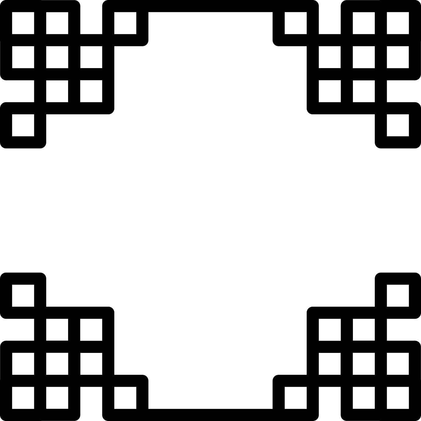
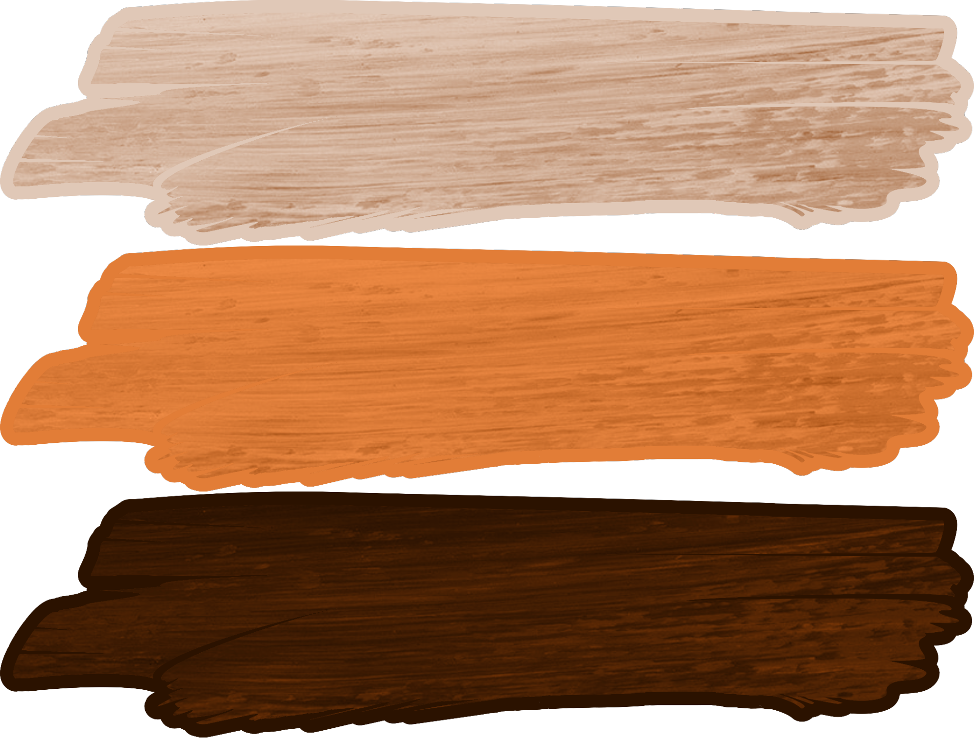
For ToT I not only designed the UX for positioning and visual feedback of UI elements, but also created the UI art for the game. There where three key design elements, that where used to deliver the japanese theme of the game: boxes (resembling traditional japanese window and door frames), brush strokes (refering to calligraphy) and wood (also relating to traditional japanese wood and paper doors and furniture). You can find these elements in every asset I created for the UI. A few examples you can already see in the section above, concerning the UX design of menus and the HUD but the images below and on the right will paint the picture a bit further:

Here I want to highlight the UI elements displaying information about the Attack moves in the HUD of the players (as already partially seen here) and especially the move icons seen above. The purpose of these is to communicate fast and clear, which attack move the player can expect to get, when selecting the respective skill to put into their skillset. The icons are visible in the skill pop-ups when standing near a skill orb and for attack moves that are part of the personal move set at all times in the HUD of the player. When designing the look of the figures depicting the attack moves, I also aimed to match the box elements and linework of the main design elements. Most menu items mainly use those box elements in a kind of mosaik relation, the buttons and tabs of the menus (seen on the right) are based on the brush stroke part of the key design elements.

Additionally to readable and clean icons, information about the state the move is currently in and the type or effect of attack move also had to be included in the design for the HUD. I already talked about the state of the moves in the last section about the UX design here, in the image above you can see the actual implementation in-game with the swallow dance attack move as an example at the top. There you can also see the implementation of including the effect of an attack into the UI of the attack moves: for each effect camel, cobra, falcon and dragon there is an unobtrusive animated background apprearing as ring around the attack icon, each with a different color and animation matching the chosen effect. The swallow dance in the example has the falcon effect.

Last but not least, the healthbar was also designed with key box elements and a double lined frame. It also has an effect when the player is loosing health, and an indentation in the middle, so that the player can see when the hit points are half-way depleted more easily. You can see the health bar in the side-by-side comparison at the beginning of the UX section and above.
Below I added some examples for the UI in context of the game and the menus. Note that with the splash screen and main menu, those have a view into the games HUB in the background, panning slowly around the center.


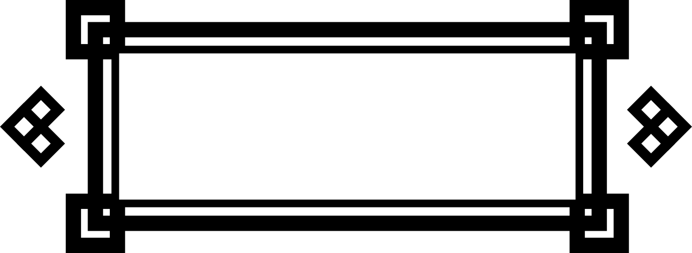
From top left: menu frame, over-head pointer (in team color), game frame (decorative), menu buttons (disabled, selected, deselected), swap selection element

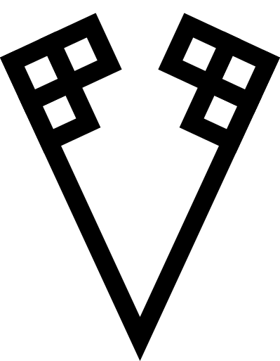
Logo design
I created both the Trial of Two logo and the logo for Oilcatz as vector graphics in Inkscape. The logo for the game should represent classic fighting game logo aesthetics which mostly have some kind of brush stroke or frayed banner included. The jagged font was also highly inspired by existing fighting game logos, for example Street Fighter IV. Using brush (strokes) and wood as themes in the logo design also relates to the setting of the game, which is supposed to be japanese-inspired.
The Oilcatz logo on the other hand was designed (mostly) monochrome and with simpler forms, while also including japanese-related themes, even if those are very subtle. Both the claw machine grappler which is heaving the cat out of the oil and the mochi-formed cat itsself refer to that.
Over the course of the project I learned a lot about using Inkscape and creating vector graphics in general, iterating the design and implementation of the graphics as I moved forward. In the end, I’m quite proud of the final logos.

Art Direction
For the art direction in Trial of Two I created moodboards and an art vision document in the beginning for acquiring our 3D artist for the game. During the project I created an extensive spreadsheet for organising all 3D art assets and their progress in the project. You can see an example below. The full spreadsheet for 3D art assets can be downloaded here, if you’re interested:

I also established an art asset pipeline for the 2D art and documented it with the diagram you see below. In this project I had the roles of 2D Artist, UX Designer and UI Animator, so the diagram would apply better to a bigger team with more persons for all the roles and was mostly produced as university course assignment and for practice.

Project Management
After our first project manager left the team due to her finishing her studies at university, I took over the job of project manager. I mostly organized team meetings, kept track of the tasks in our Kanban board and organized protocols and documents resulting from meetings and playtests. I was also responsible for submitting our project to different contests like the Macht Spiele Woche in Bayreuth, the Deutscher Computerspielpreis and the bidt Demo Days, where we also won the first price in the category games and recreation in 2021. Furthermore I was producing, collecting and entering data for submitting Trial of Two on Steam, while our 3D artist and treasurer took care of the financial and legal part of our company business. Together we managed to finish Trial of Two in about 2 years as our first ‘real’ game project and also our first entry on Steam.
